A Brief Introduction to Sidebars & Graphical Widgets
If you’ve ever looked into web design before then you’ve probably heard of widgets. The goal of widgets is to display specific information to the reader and even allow them to interact with the website. Interactional elements include buttons, checkboxes and search bars. Sidebar widgets are also commonly used to display author bio excerpts, or links to recent posts and social network feeds. This increases functionality on your website.
We love adding functional components to our websites, and we know that website visitors love using them too. Graphical widgets consistently play an important role in website design, and though widgets have been in use for many years, they remain as relevant as ever. In website building we use widgets to create user interface elements, which the website visitor can interact with on different pages. In this post we’re going to shed some light onto the sidebar widget and why it’s a go-to for selling tours.
Structures & Sidebars
As we’ve covered recently, if you want to have an amazing website then complimentative and attractive colours, a structure that’s easy to follow, and a layout that guides your vision smoothly are all essential. Sidebars play their part too, especially when it comes to drawing a customer’s eye to the booking button.
How and where does your visitor book the tour? Hyperlinks alone, though useful to helping website visitors navigate to other relevant information on your tourism website (including your booking form or other products), are not the most efficient way to lead them to buy your tour — enter: the sidebar. The sidebar is a website visitor’s loyal companion. Following them as they scroll down, then up, and then down a little further. This user-friendly scrolling pattern means the sidebar is a fantastic tool that allows us to display supplementary information for the reader as well as permitting them to interact with buttons.
Calls To Action in the Sidebar
In marketing, a call to action is a strategy conveyed through a design element to entice readers to literally take action. Though it’s not about making a collage of “Book Now” buttons all over your website, as this would look odd, and the “less is more” motto applies very closely to this context. We place CTAs in the sidebar, so they are permanently present while the reader takes in the information that is presented through text and images, even while they are scrolling down the page.
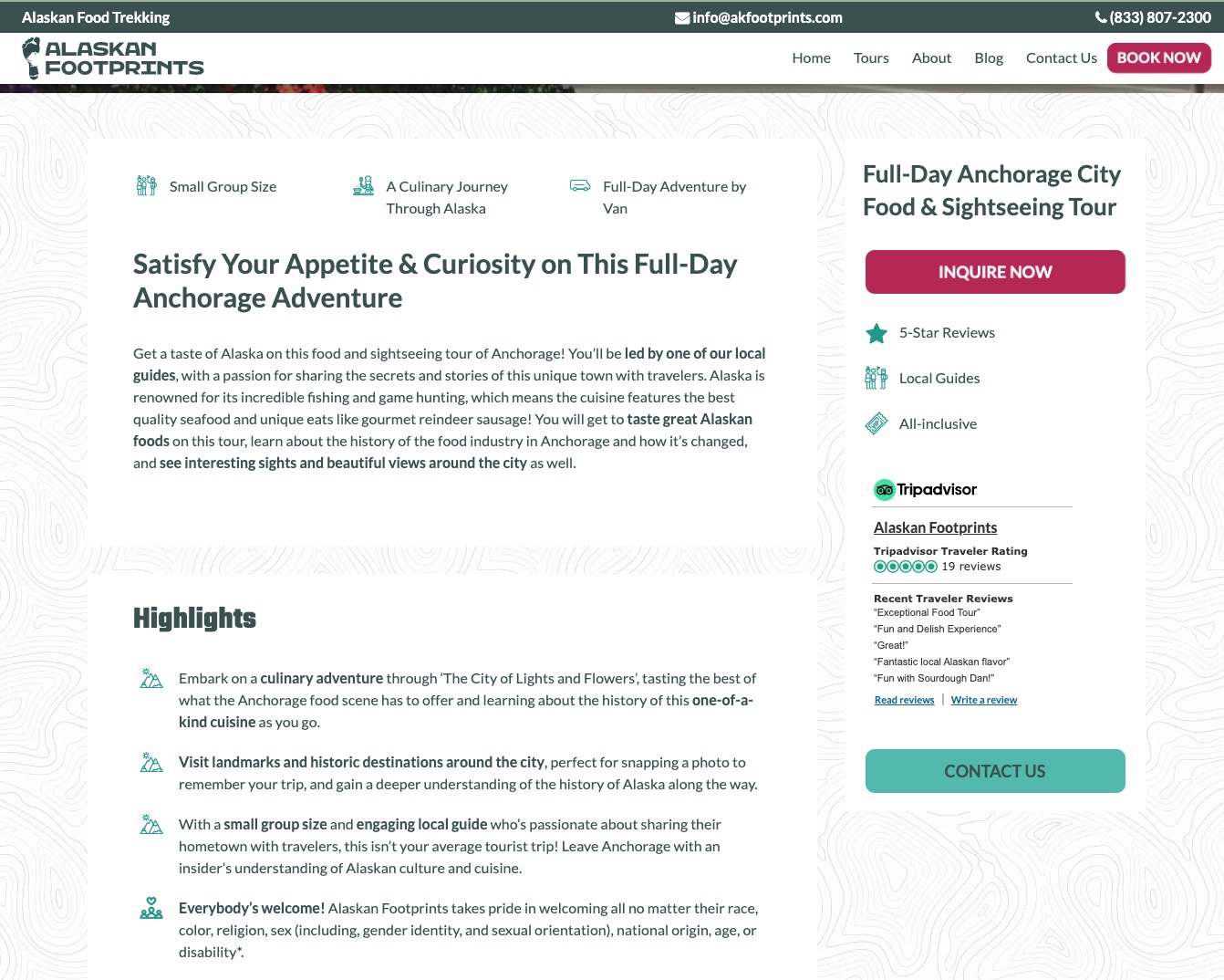
In the below example of a TourismTiger website, you can see that a clean layout is achieved by careful placement of templates and widgets, and maintaining a balance between text areas, images, background texture and white space. Arguably, the star of the show is the sidebar, set to the right of the page. Observe as we scroll down and up again, the sidebar accompanies us the whole time. In this sidebar we have CTA (Call To Action) buttons and a TripAdvisor widget, along with the tour business’s UPSs (Unique Selling Points). The TripAdvisor widget serves as further encouragement for the visitor to buy the tour, based on the thriving reviews that are shown in the sidebar.
Certain types of visitors may not require a full overview of your tour, before they decide that they want to book it, and other visitors may be going back to your website for a second visit, only this time to directly make the booking. We can all agree that it’s a nuisance to scroll through a whole page before finding a piece of information or link that you are looking for, in order to make a purchase. This is why, using the sidebar can facilitate that option at any given time. And for those of us always in need of more information, the “Contact Us” button entices some types of customers to get in touch and ask any other questions they may have before buying a tour, rather than just leaving the website and keeping their doubts. The call to actions are emphasised even more with eye-catching pulsing movements.
For a more thorough underlining of CTAs and how they serve us in the world of e-commerce, click here to read our blog on how to increase your tour bookings with effective CTAs.
One of the things customers love most about TourismTiger websites is how customizable they can be. Click this link to check out our portfolio and see for yourself, and then book a free consultation with us today to start your journey to a brand new business website that sells more tours!
Find this article useful? Enter your details below to receive your FREE copy of 95 Epic Places To List Your Tours and receive regular updates from Tourism Tiger and leading industry experts.
By submitting this form, you agree to Tourism Tiger contacting you via email.