It all started in print journalism. The person holding the newspaper in the street yelling ‘Extra! Extra! Read all about it!’ The newspaper hawkers would hold up the newspaper folded in half with the eye-catching headlines and subheadings in plain sight. Or, when walking by a newspaper stand, have you noticed how customers are only shown the top half of the paper? This is called ‘above the fold’ and the content on this area is what the editors believe will sell the paper.
This is an important factor in today’s web design. Above the fold in website terms is what you first see on the screen without scrolling when you click onto a website. There are varying factors as to why this section of any website is important but first, it’s helpful to understand that there is no one correct way on how to lay it out. The Nielsen Norman Group, researchers of user-based internet experience, state that 80% of website visitors(opens in a new tab) won’t scroll past the fold. Whereas others agree it’s essential to have this section accurate but it’s not the be-all and end-all. Quite the opposite. More and more website visitors these days need to trust the website they are on and will continue scrolling until they find what they’re looking for or feel that they can trust where they are.
Throughout this post, we’ll speak to our lead designer here at Tourism Tiger to discuss the effectiveness of the above the fold area from a design perspective and also provide you with some good practices to take away with you.
Why is the Fold Essential?
Andrea Lopez, Tourism Tiger’s lead designer, was asked what her interpretation of the fold is and how important it is in regards to web design.
“It’s incredibly powerful for converting lookers into bookers, reducing the bounce rate and making the user experience and journey throughout the website more enjoyable, accurate and memorable!”
Andrea then continued with the fold “is crucial for conversion and it needs to be impactful enough to motivate users to scroll down and browse throughout the page/website. And by impactful, I not only mean choosing a breathtaking photo but including information to make it relevant to what users are looking for. For example, if I just landed on an About Us page, not only as a user do I need to have a visual cue of where I am (e.g. About A Tour Operator Company), it should feature additional information that motivates me to engage (e.g. a headline that reads ‘Learn the story of how we became the #1 TripAdvisor) and ideally, an immediate action to take based on the information being presented (eg a button that anchors me directly to the ‘Meet Our Guides’ section of the page).”
Our Tips
Here are some of our tips and ideas for constructing the fold on your website.
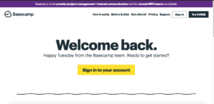
1. Don’t use up free space sparingly. Focus on the quality of the content above the fold and ensure what is visible to a new user is precise, accurate, and inviting. Look at this landing page example from Basecamp(opens in a new tab): it’s clean, it’s clear, and is easy to navigate. What’s the takeaway? Keep it simple.
2. As Andrea mentioned above, you should also make it clear that there is more below the fold so the user knows that they can scroll and continue browsing. Take Slack(opens in a new tab), for example, you can see on this image that there is clearly something more below:

A feature or message that says don’t click off, continue reading! Seeing this soft but clear ‘false bottom’ is very important as the page should flow naturally, draw the user in, and result in more users staying longer on your site.
3. Last but not least, call to actions above the fold. Having a clearly visible call to action button is imperative. Someone visiting your site may already want to purchase or book with you, and having the ‘book now’ above the fold, in pride of place as the user lands on the page, makes sealing the deal a lot easier. And when it comes to selling tours, we know what we’re talking about. Take Insight Cities(opens in a new tab), for example, they do tours around central Europe (with a call to action to ‘view our cities’), there is a beautiful hero image and also two clear Book Now buttons. We know exactly what they do and it’s clear and easy for us to take action.

For some users, however, they may be unsure about the company’s offerings and want to find out more before booking. Again, linking to what we spoke about earlier by having a clear and concise landing page indicating exactly what you do and making it clear that there is more information below. On the example above, the ‘View Our Cities’ button anchors to content further down below the fold, inviting users to continue their journey.
Conclusion
The balance between content and design is key in regards to above the fold creation. When building yours, think about what you need people to know about your business and what action they need to take. Having users understand exactly where you are and what you do coupled with an eye-catching, easy-to-use design seems difficult but the results are worth the effort. The balance is key. Contact us(opens in a new tab) about us designing your website and we’ll ensure everything we discussed in this post is working for you!
Find this article useful? Enter your details below to receive your FREE copy of 95 Epic Places To List Your Tours and receive regular updates from Tourism Tiger and leading industry experts.
By submitting this form, you agree to Tourism Tiger contacting you via email.