There are so many things to consider when designing a logo. The process could literally cost tens of thousands of dollars and take months to complete. That’s what American Express did when they hired world-famous Pentagram Design to refresh their iconic logo(opens in a new tab).
However, not every business has the same luxury that American Express has. Fortunately for you, it’s now easier than ever to create a great looking logo that will serve your tour business well for years to come.
To help you get there, I’m going to share with you a handful of best practices to keep in mind when designing a logo. In this blog post you’ll learn:
- How to incorporate your brand’s colors and slogan
- Tips for creating multiple versions of your logo
- A process for gathering valuable feedback to save you time and money
- How to manage your logo and brand assets so you don’t lose brand equity
Read on to learn more about these best practices as well as get recommendations on resources to make designing your logo a positive experience.
Incorporate Your Brand’s Colors
When designing your logo it’s important that you stay true to your branding. This is especially true for your logo since it’s your most recognizable brand asset.
Since you’ll likely use your logo on your website, employee uniforms, and brochures, you should design your logo so that it is recognizable without the context of your website or social media profile.
If you’re still at the stage where you haven’t decided on colors for your logo yet, take a minute to learn about color psychology(opens in a new tab) before you make a decision.
The colors you choose for your brand, and your logo, can have a huge impact on the way consumers perceive your brand or even how they perceive what kind of services you offer.
To put that into perspective, take a look at what happens when you switch the colors of these two travel companies:
 The new colors don’t suit the logos as well as the original colors do they? The reason why the new colors don’t feel right is likely because you subconsciously associate each brand’s original colors with their services.
Slogan Or No Slogan?
When designing your logo you may want to consider including a slogan or a value proposition in the design.
This is helpful in cases where your logo is standing alone without any context from a website or a social media profile. By including a slogan in your logo it helps potential customers learn more about your services or the value you provide with a quick glance.
Here’s an example of this from Tourism Tiger client Florida Outdoor Adventures(opens in a new tab):
![]()
Notice how they added “Guided Everglades Kayak Tours” to their logo?
By including this in their logo they can position themselves as the leaders for these types of tours and stand out from other tour operators whose tours are less specialized.
Keep in mind, just because you have a version of your logo which includes your slogan, it doesn’t mean you have to use that version in every instance.
Which brings me to my next point…
Create Multiple Versions and Layouts
When your logo is finalized you’ll end up using it in many different places and, unfortunately, the layout of your logo might not always look good in every situation.
This is why it’s important to create variations of your logo in multiple layouts so you have options when using your logo in email newsletters, social media profiles, letterhead, etc.
I recommend always creating a version that includes an icon and typography like the Tourism Tiger logo does.
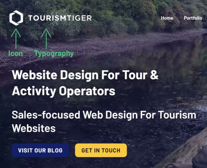
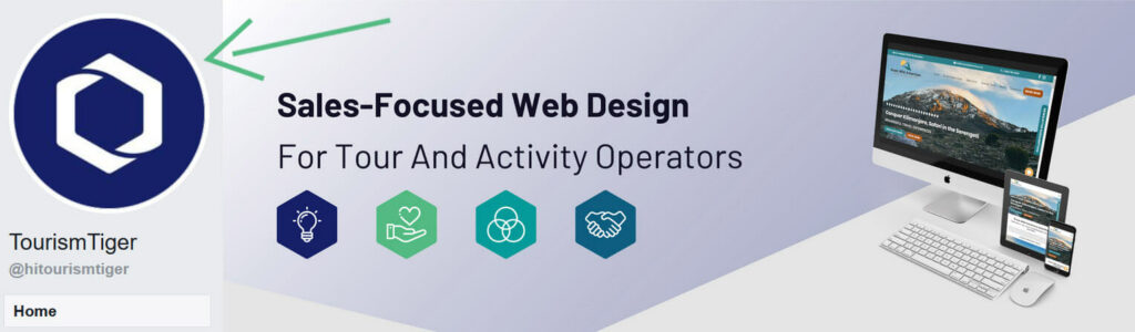
This way you can use the icon by itself in those situations where the typography wouldn’t look well standing on its own. Here’s an example from the Tourism Tiger Facebook Page(opens in a new tab).
In addition to a version with and without typography, you should create light and dark versions too.
This way you have options so your logo is always readable no matter what color the background is, because a version of your logo with a white font color wouldn’t easily be readable against a white background.
Gather Feedback
Once you’ve created the first version of your logo it’s important to start gathering feedback early in the design process. Doing so can save you time and money as it will reduce the number of revisions you’ll need in order to get to a final version.
The easiest way to gather feedback at scale is to send out a survey to anyone you think would be able to give you valuable feedback. This includes employees, potential customers, friends, and family.
You can use a tool like SurveyMonkey to gather feedback and you can get up and running quickly by using their logo testing survey template(opens in a new tab). Or if budget is an issue you can create something similar for free using Google Forms(opens in a new tab).
Since you don’t want to introduce bias into their feedback it’s important to ask them open ended questions.
Here are some examples of questions that are good to ask in your survey:
- What does this logo remind you of?
- When looking at this logo, what services do you think are being offered?
- How does this logo make you feel?
- Based on this logo would you do business with this company?
After you’ve received everyone’s responses, look for common themes that stand out and use that feedback to drive further revisions until you have a logo that you’re absolutely happy with.
Branding
Now that you’ve learned some best practices for creating a logo it’s important to take a minute to discuss how to maintain control of your logo’s appearance.
Why is maintaining your logo’s appearance so important?
First, you’ve likely invested a lot of time and money into creating it. For that reason you’ll want to protect your investment.
Second, your logo is an asset which has a value associated with it. As your business grows in value that value will transfer to your logo once it becomes a household name.
To maintain that value that you’ve worked so hard to create, here are couple of best practices to follow.
Create a Brand Guide
A brand guide(opens in a new tab) is documentation for your team to reference whenever they use your company’s logo in any marketing materials.
At a minimum it should include all of the approved variations of your logo and rules for how they can be used. For example, it should have both the light and dark versions of your logo and should show examples of when you would want to use each version.
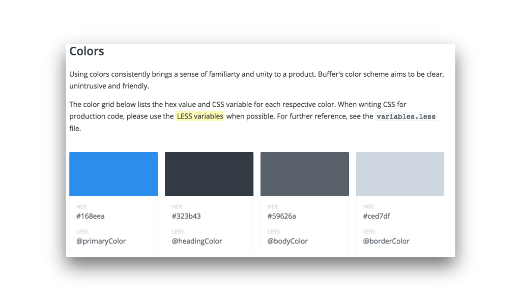
Here’s a great example of a brand guide from Buffer, or as they call it their “Style Guide(opens in a new tab)”.
Why use a brand guide?
A brand guide will help maintain the standards you’ve set for displaying your company logo and since you can always reference it you never have to worry about the look of your logo accidentally evolving over time.
Imagine if an employee alters your logo just a little bit to make it work for a particular use case and then sometime in the future another employee alters that altered version. Over time you’ll eventually end up with a logo that looks completely different than the original!
It’s almost like a branding version of the telephone game except each change is so subtle you never notice until it’s too late.
Pro tip: For a quick and easy way to create a brand guide use a service like Frontify(opens in a new tab). Or if budget is a concern a simple Google Doc along with links to brand assets will do fine.
Media Kit
Secondly, if you’re doing a public relations campaign or your business happens to be getting press it can be hard to control how others are using your logo.
They may borrow a version from one of your social media profiles or they might just find a version by using Google. Since this isn’t ideal, you’ll want to make it easy for them to use the highest quality version of your logo, and while you’re at it give them tips about the best way to display it.
Here’s a great example from tour booking software provider ActivityRez(opens in a new tab). They’ve created a page directly on their website that people can use to download a high-quality version of their logo along with guidelines for the proper way to display their name.
Conclusion
Designing a logo may seem like a challenge but it’s important to take the process seriously as it can have a direct effect on your business and the perception of your brand.
In the previous paragraphs, I’ve explained how to incorporate your brand’s colors, best practices for creating multiple versions of your logo, a process for gathering feedback, and how to manage your logo so you don’t lose brand equity.
Follow my advice above when creating your logo and it will give you the confidence to create a logo you can be proud of!
At Tourism Tiger, we have a digital branding design(opens in a new tab) package for those looking to create or evolve a new or existing product. Get in touch to find out more today(opens in a new tab)!
Over To You
- Did you use any of these best practices when you created your company logo? If so, what were your results?
I’d love to hear your thoughts! Let’s chat on Twitter(opens in a new tab).
This is a guest blog post by Michael Folling. He is the founder of Limitless Designs(opens in a new tab) and author of 101 eCommerce Tips(opens in a new tab). He enjoys building brands and writing about eCommerce.
Find this article useful? Enter your details below to receive your FREE copy of 95 Epic Places To List Your Tours and receive regular updates from Tourism Tiger and leading industry experts.
By submitting the form below, you agree to Tourism Tiger contacting you via email.