Click below to watch the webinar Tourism Tiger’s Director of Business Development did for Rezdy(opens in a new tab).
READ ON FOR THE TRANSCRIPT OF THE WEBINAR
Why are we talking about clarity today? Well, according to Dr. Flint McGlaughlin, author of The Marketer as Philosopher, clarity trumps persuasion every time. You could have the most beautiful looking website out there or the best tours on the Gold Coast, but if you don’t communicate quickly and effectively, no one will get that far. So over the next 30 minutes, we’ll explore how we can improve website clarity to increase the probability of converting your website visitors into customers and reduce ‘bounce rates’ and visitor confusion.
We’ll be covering:
- First impressions and how applying clarity principles leads to interest
- Helping your visitor take action once interest is created
- Getting about and exploring your site
- Communicating important info, making it easy to find
- Applying these principles to your SEO ranking
First Impressions
If you’re like most tour operators, you invest significant time and resources into your website’s sales funnel, forms, booking software, infrastructure, and many other features that are deeper down in the funnel.
But, if you don’t command your visitors’ attention long enough to get them that deep into your website, all of these investments are for nothing. While you can relax knowing that Rezdy is taking care of the back end, research has found that most of the gain from optimizing a website occurs in the first seven seconds of users’ experience. Millions of dollars are won or lost in these first few moments a visitor spends on your site.
There are three simple questions users subconsciously ask when they arrive on your page.
Your website must have an answer to:
- Where am I?
- What can I do here?
- Why should I do it?
We’re going to concentrate on the first 2.
Question 1: Where am I?
This question may seem simple, yet so many websites don’t answer it. I see so many tour operators trying to create their own version of Mazda’s ‘Zoom, Zoom’ (2000) or McDonald’s’ ‘I’m Lovin’ It’ (2003) campaigns – phrases that with no context mean nothing – and hope it sticks within seconds. Successful online marketing is not that easy, especially without these companies’ existing brand awareness, not to mention their billions of advertising dollars.
To understand why the question ‘Where am I?’ can have such a profound effect on the success of your website, it is important to think like your visitor. It’s likely that they have no idea about your company and don’t have time to play games. Brand awareness must be earned!
Let’s think about how your prospective customer interacts with the physical world. When visitors come to your office or tour location for the first time, they have all their senses at their disposal to understand more about you. They will have been using these senses throughout their journey to your door giving context to experience. They see how you and your staff present yourselves, they may see other operators nearby to compare you to, they can take in the breathtaking views of Sydney Harbour, they hear the type of music playing in the background, feel the seats in your vehicle — even the smells in your environment release different emotions. These senses allow your visitor to orientate themselves subconsciously.
We also have politeness to factor in: when someone approaches you in person, they feel they have a social obligation to choose you. This social compliance doesn’t exist online. On top of that, due to welcome music being a huge turn off online, we only have sight to engage the visitor. Therefore, the virtual visitor experience is massively different and needs to be orientated.
A movie is a perfect example of this need for orientation. A well-produced movie would never assume the viewer knows he is in Paris. There are a few signature location shots of the Eiffel Tower and Arc de Triomphe, perhaps even the Louvre, before the film returns to the plot. Sometimes, to ram it home, they display the name of the location by filming a sign or superimposing the name on the screen in addition to signifying a change of time, like ‘Paris 1997’ or ‘6 months earlier’.
Going back to the first question ‘Where am I?’: the answer to this question should be almost instantaneous.
Question 2: What can I do here?
In the next couples of seconds, they must know what they can do or what you offer to move them into the interest phrase. It sounds simple and obvious, but think for a moment how many websites do not follow these simple principles, how many websites overload visitors with animations, sliders, sometimes with multiple headers, multiple columns, offers, and no clear direction of what they actually do. You can understand how important it is to dissect those first few moments a customer spends on your site and fully understand what they are thinking.
In answering question 2, clarity is, again, key. The stumbling block of momentum is confusion. In order for prospective customers to feel compelled to move through your site and show interest, you must clearly tell them what they can do there.
Here are our five tips on making an EFFECTIVE first impression:
1. Be crazily obvious.
When selecting your hero image, headers, and subheaders, demonstrate where you are and what you do.
2. Don’t use sliders.
Sliders slow down pages, which impacts SEO(opens in a new tab) and conversion rates. Some sliders also do not transition well to mobile. Sliders might give the impression that the company was not sure what to highlight, so they tried displaying everything at the same time, hoping something would stick. This adds to confusion around your value proposition. This applies to both sliding images and headers. CHOOSE YOUR BEST, AND STICK WITH IT.
3. Ensure your text is readable.
Be sure it doesn’t blend into the background, you’re not using an over-elaborate font, and it’s an adequate size.
4. Image selection is very important.
Since 2015, tourism web design has had a strong focus on the hero area image — the part of your homepage that appears ‘above the fold’. Around 90% of the people on this webinar will have a hero image that dominates their homepage. This is part of the clarity message: answer both question 1 and 2 in one through your hero image. Remember the old saying that ‘a picture tells a thousand words’? Think about how many words you can communicate by replacing that image with a dynamic video. There’s debate over using video in hero areas, once again due to page loading speeds, but at Tourism Tiger, if a client has a great video, we load it over fast internet connection on desktop and laptop with an image loading on mobile devices and over poor connections.
5. Drive the first click.
So, what clicks do we need to drive? 70% of people book on 2nd, 3rd, 4th, or even 5th visit to your website. So we need to reduce friction and be really clear how to book once they land on the website.
Book now buttons in the menu bar, where possible, are therefore a must. A/B testing shows that websites with a ‘book now’ CTA in the menu increase conversion. Due to the phenomenon of menu blindness (some people just don’t look towards the menu, something we’ve picked up on using heat maps) people need the option to skip the process and book straight away through the homepage.
Repeat visitors tend to only be around 30% of overall traffic, so what about the other 70%? Are they likely to click ‘book now’ as soon as they land? Probably not. These people need a driver too. This driver needs to be clear. So when it comes to driving actions, as I mentioned, don’t rely on the menu.
- Align your goal with the visitors’ goal. Think about where the majority of your visitors want to go and what you therefore want to do.
- Make it stand out. We generally shy away from opaque buttons and choose contrasting colors.
- ALWAYS use a button. Hyperlinked text or images aren’t clear. Remember: always be stupidly obvious.
- Instructive beats passive. Buttons that say ‘our tours’ have a lower click-through rate than ‘view tours’. Use A/B testing where possible to work out the best instruction for your website.
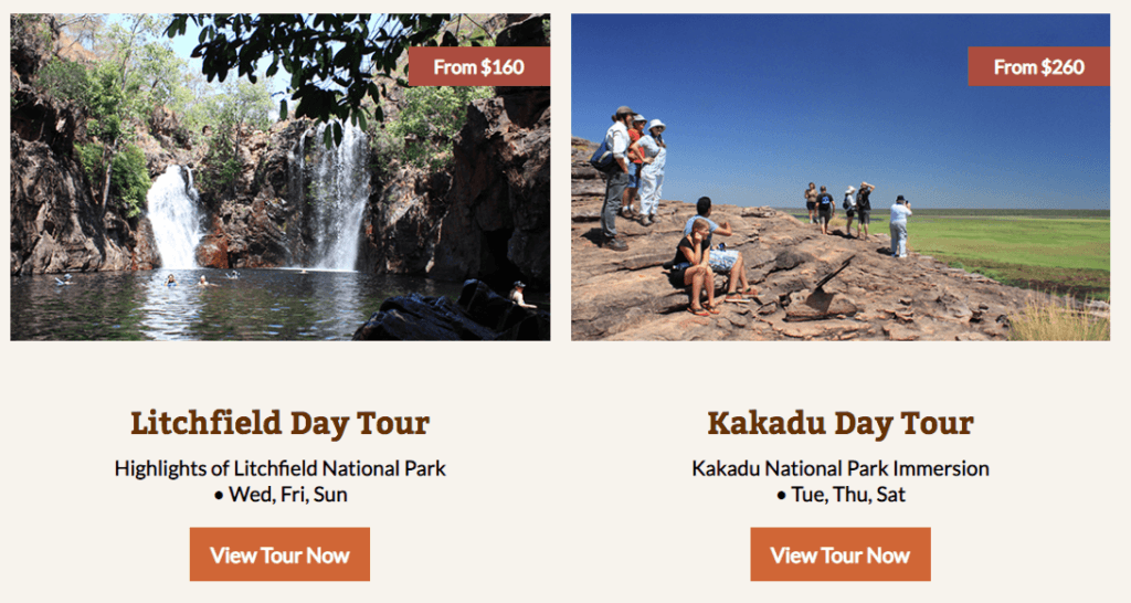
Let’s look at a couple of examples combining the first impression with the first click.
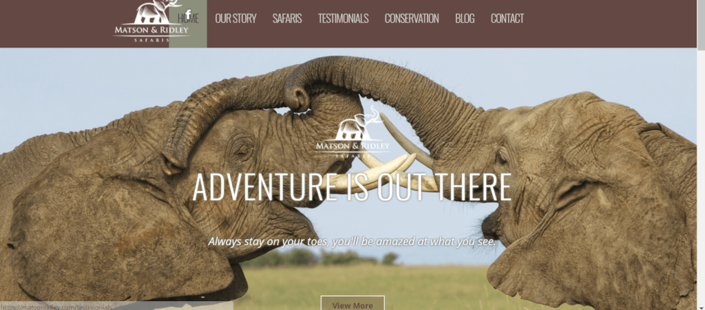
Remember menu blindness. First impressions, nice picture of elephants, but I’ve no idea how that relates to me or this company. I don’t know where this company is or what they do. I can assume they are in Africa, which is a huge continent, so where in Africa? Or is it a zoo? Their headers are generic, and the subheader disappears into the image. Also, the opaque ‘view more’ button looks camouflaged into the background — maybe to get a better view of the elephants? Although the image is great, they could use a long distance shot to capture the tourists interacting in the environment. At least that would give a better idea of their product.
Now, here is a good example.
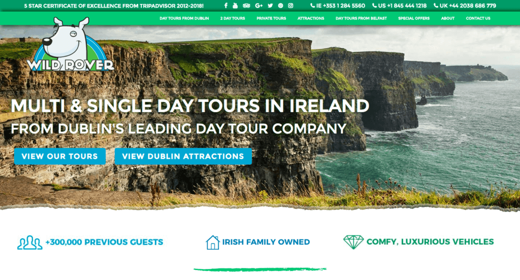
I don’t need to tell you where this company is based or what they offer. The background image is clear to people visiting Ireland that it is their most popular landmark, the Cliffs of Moher. We integrated a booking software that doesn’t allow a general book now option, so instead, we give visitors two clear paths to go down.
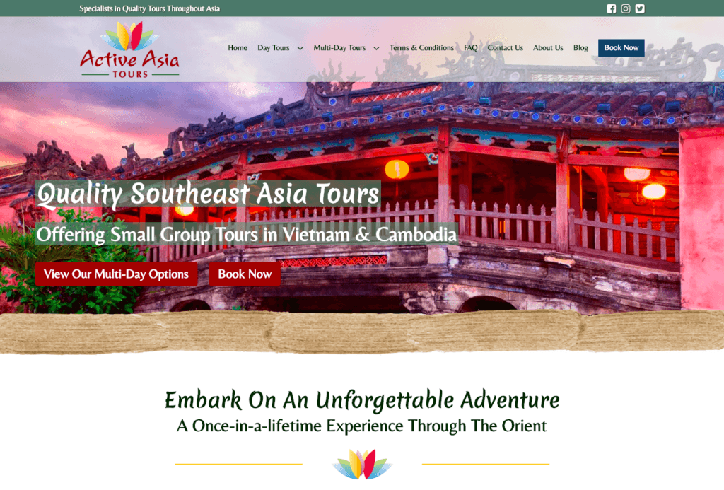
This is a perfect example that we built for Active Asia Tours. Both questions are answered: I know where I am and what I can do. The call to action buttons both stand out, and I know where they lead. The book now button in the menu also stands out and is clearly visible to menu browsers.
So we’ve covered the first two sections of today’s webinar: first impressions and driving the first click. Moving on to the third section.
Getting about and navigation
We have identified two types of website visitors: page navigators and menu navigators. Page navigators will either try to click everything on a page or rely strongly on you to guide them. Look at this homepage section for example.
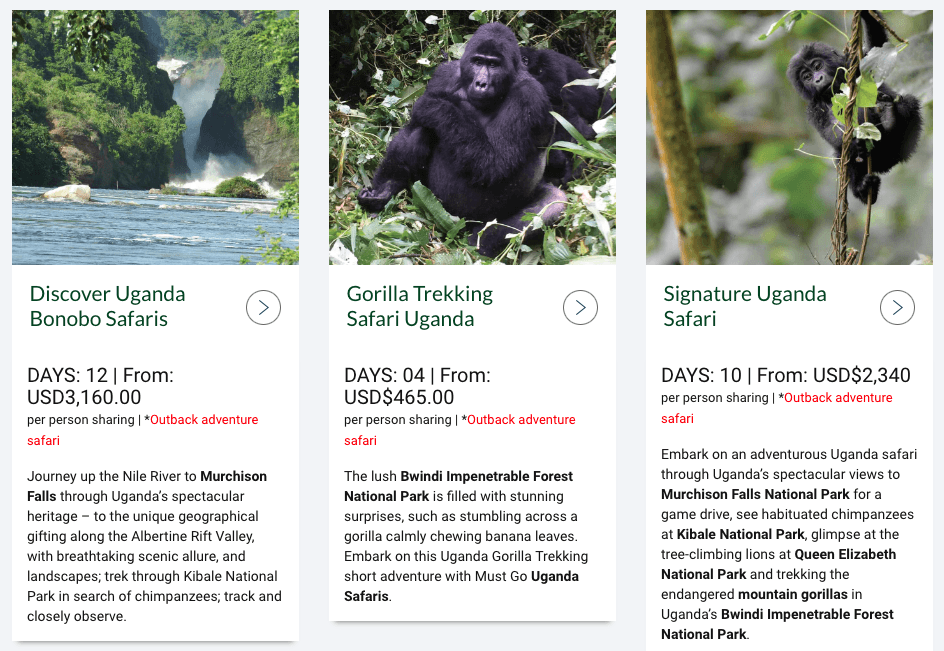
The pictures are cool. They give me all the basic info I’d want, but the CTA of a greater than sign isn’t obvious. I don’t know where it leads to, and some people won’t even recognize it as being clickable. On top of that, it’s the only way I have to click through. The operator could make the whole content card click-through and even add a CTA of ‘read more’, ‘more info’, etc. That would come down to click-through A/B testing.
This is from a website we built in Darwin. Same level of basic info, but I know exactly where to click and where it’s going to take me.
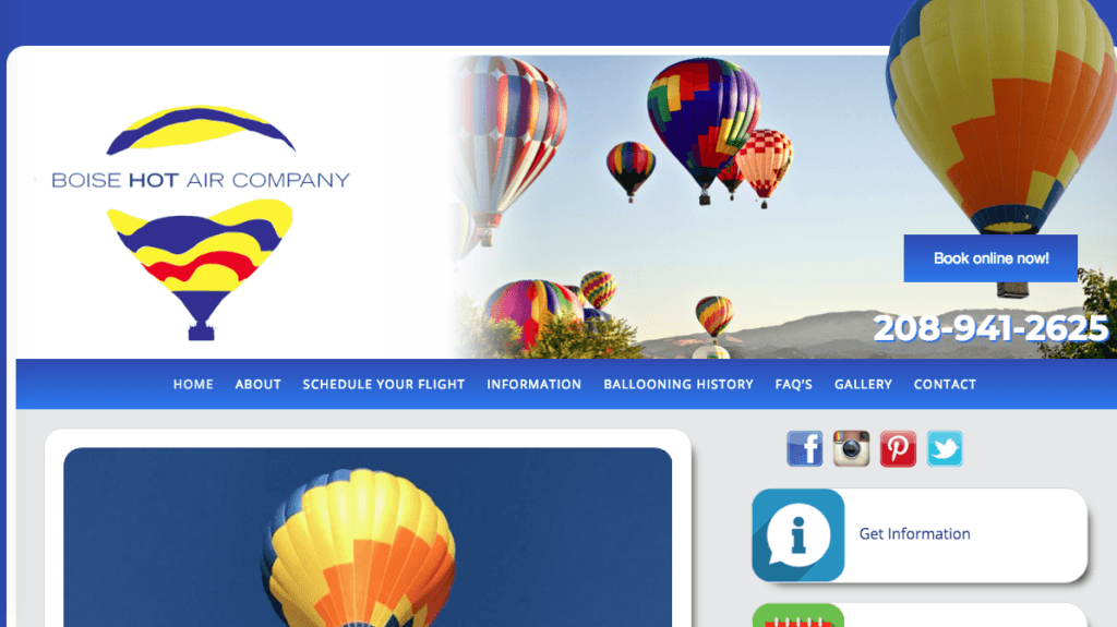
Coming onto the menu navigators: each menu option has to be clear where that leads to. Take this screenshot from Boise Ballooning as an example: skipping over the lack of a visible header, let’s go straight to the menu. Here we can see the 2nd option is ‘About’. We also have ‘Information’, ‘Ballooning History’, and ‘FAQs’.
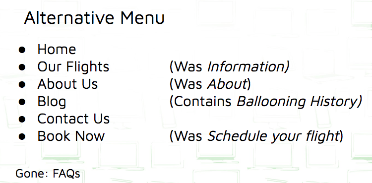
This is how I would add clarity to Boise Hot Air company’s menu:
To summarise…
- Anticipate potential confusions with language
- Make it obvious where each link will send your visitor
- Monitor your site clicks using heat maps to find out where people TRY to click or where they just aren’t clicking
- Apply KISS: Keep it simple, stupid
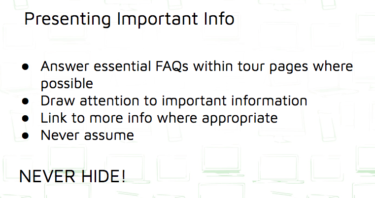
Once your visitor has started navigating – because it’s now really clear to get around your site – you need to make sure they can access the relevant information they’re looking for. There is a minimum of four key points of the tour that someone who has entered the interest stage needs to know to help answer the question of ‘why should I book’? The primary considerations include how much it costs, what time it starts, where it starts, how long it is, and can I do it? Is it suitable for me?
When I visit this tour page, it answers none of these questions. In fact, I have to search through the text to realize this. Whenever we build a page, we have to think like the tourist — what information would WE would want to know — and then pull it out to make it easy. Matt, our founder, did a webinar last year with Rezdy where he went deeper into the different people who book tours and how we can sell to them(opens in a new tab).
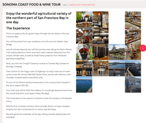
Look at this example of a section from the tour page of Sydney Harbour Boat Tours, a site we built.
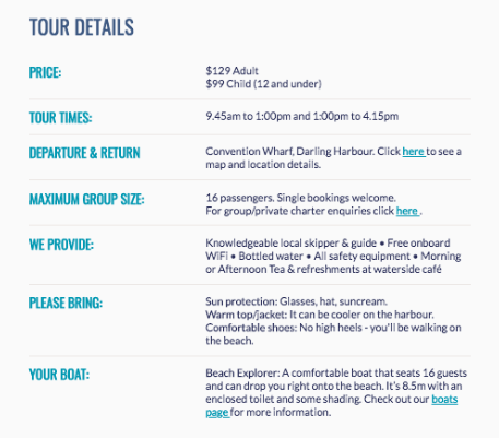
We have this section below the initial gallery and brief description to pull out the key details that the average guest would need. Once the visitor has this info, they can read deeper into the experience if required. Always break up key info from paragraphs and present it clearly.
Now recently I spoke to a helicopter tour operator in the US who was looking to increase his online bookings and reduce user friction. I did some more research into his company and how else a new website could help, which led me to check out his TripAdvisor account, especially the 1-star reviews. Here’s what I found:
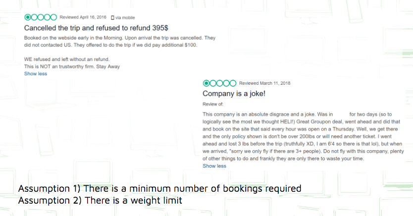
Looking at the first review, the fact that the client was told that the tour would only go ahead for an additional sum of $100 before being ultimately canceled, we can assume that there was potentially a minimum number of guests required to fly.
The second review confirms this, with the guest being explicitly told that they require a minimum of 3 fliers and again having his flight canceled. In addition to this, this same guest was forced to lose 3 lb on the day of his flight due to turning up on the day and discovering a weight limit of 200 lb – of which he was slightly over.
I know everyone HATES receiving a 1-star TripAdvisor review, so I thought I’d bring this up to the operator in question. Before that, I checked the site as I anticipated the following response:
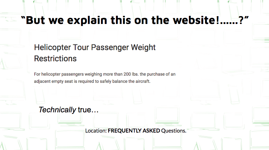
After extensively searching the site, I couldn’t find any mention of a minimum occupancy; however, I did find it hidden away on the FAQ page.
Why was it in the frequently asked questions? If I were to go on a helicopter tour, I certainly wouldn’t be asking whether I’m too heavy to travel in a 6-tonne helicopter. It isn’t intuitive to hide this in the FAQs. This should be clear in the sales funnel, specifically on tour pages.
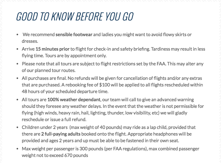
This is from a website we built for a DIFFERENT helicopter company in the states, Hangar21. We included this section in each of their tour pages IN ADDITION to the FAQs. This information is too important to miss. One negative review has more impact on your business than selling another ticket, and customers will be grateful to know this upfront. Hangar21 also only allow a minimum of 2 tickets to be bought per transaction, meaning they only cancel due to weather conditions.
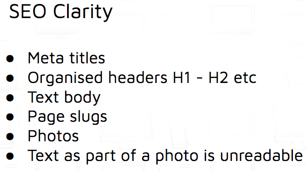
So SEO is a major concern for a lot of people I speak to, especially in highly competitive regions. If you don’t have the budget to pay an SEO specialist, then these are a couple of tips on how applying the same clarity principles to your website can help your SEO ranking.
Treat Google as you would a website visitor. Again, a tagline or header such as ‘Making your dreams come true’ won’t help you with Google. You want to avoid wishy-washy language and instead be very clear. Tell Google:
- Where you are
- What you offer
And as Google is essentially recommending you to people, understand who these people are and what they’re searching for. For example, I spoke to a company in Aruba offering horse riding experiences. The website carried the text ‘horse riding everywhere’, which is fine if you’re from Australia, New Zealand, or the UK, for example, because we all know how to ride a horse. Our American cousins, bless them, need to know where to sit. 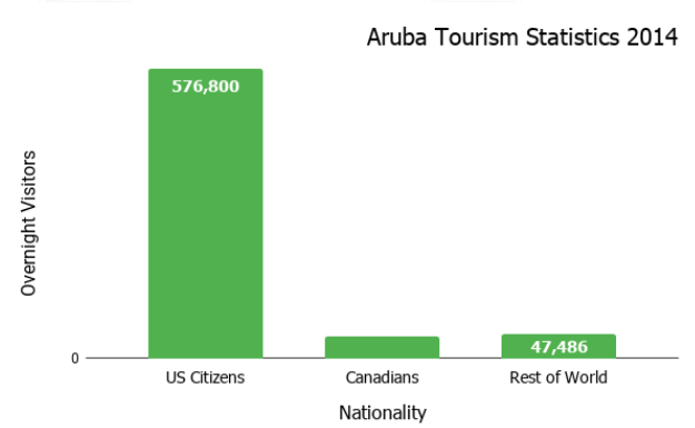 Check out the latest available visitor numbers to Aruba: there are nearly 10x more visitors from the US compared to the rest of the English-speaking world. So we can guess that these guys would be searching ‘horseback riding in Aruba’.
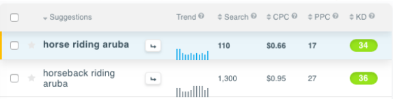
Using a keyword search tool(opens in a new tab), we can see that the search volume for horseBACK riding is 1300, compared to only 110 for horse riding. There is therefore over 10x more value in targeting the US market than the rest of the English-speaking world. So they need to rewrite the content of their website to target this market.
Meta titles. Here is an example of a meta title. This contains the most important information for Google.
Your H1 header should be the first text on your homepage followed by your H2 subheader. Again, these should explain where you are and what you do. The body of your text should be clear(opens in a new tab), original content containing the keywords that you are targeting and should make sense to both your site visitor and to search engines. You can see what a page slug is here. These should contain the relevant long-tail keywords to the page. Photos should be saved and uploaded to the website with relevant names, rather than a generic mix of numbers and letters, to enable Google to read the contents. ALWAYS upload text separate from an image to make it readable by search engines.
Any burning questions? Contact our team today!(opens in a new tab)
Find this article useful? Enter your details below to receive your FREE copy of 95 Epic Places To List Your Tours and receive regular updates from Tourism Tiger and leading industry experts.
By submitting the form, below you agree to Tourism Tiger contacting you via email.