Have you ever wondered why other websites thrive (generating inquiries, leads and sales like there’s no tomorrow), while your website lurks in the shadows, seemingly unnoticed? You’re not alone. According to HubSpot(opens in a new tab), 63% of marketers state their biggest challenge is generating traffic and leads. And, obviously, the less traffic and fewer leads your website receives, the less likely you are to make those sought-after sales.
A common misconception is that SEO, online marketing and awesome design are all it takes to generate more website visits and sales. While these are important factors, there are two major considerations that often go unregarded: content and, perhaps even more importantly, website structure. Of course, your well-researched, targeted content is what ultimately urges prospective clients to book, but what good is content when it is impossible for the user to navigate? The big question is: when you have a solid idea of your business and target market, how do you fit all the pieces together to create a well-structured sales message?
Below is a list of the essential pages/features your website should have to create a user-friendly experience (and to ultimately convert those leads):
Navigation Bar
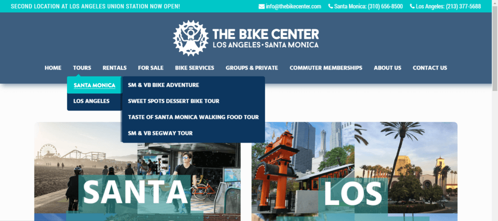
It all goes back to Tourism Tiger’s main focus – give the people the information they want without sending them on a wild goose chase first. A clear navigation bar puts an end to the chasing and directs potential customers to the page that they are searching for, quickly and painlessly. The key here is to keep it as simple as possible without omitting important pages. A bursting-at-the-seams menu might overwhelm visitors to the point where they’d rather run for the hills than try to navigate your site. A study by Forrester found that 50% of potential sales are lost because users can’t find information and 40% of users do not return to a site when their first visit is negative. Consider drop down tabs and consolidating information. Aim for clarity, not fancy names. The user needs to know exactly where to find the information they need. Here is an example of a potentially complex menu simplified.

Landing Pages
Landing pages, also known as category pages, are product-specific pages which target the key words potential customers are using in their search engines. If done right, these oft-forgotten gems can be incredibly important for increasing conversion rates. Not only this, they are also the perfect opportunity for users to find a tour that suits their criteria. So, how do we use these pages? Imagine you’re an Irish tour operator offering nationwide tours and you want your website to rank highly when people search for ‘Day tours in Dublin’ or ‘Tours in the Aran Islands’. From these search terms, you can tell that the user has the ‘commercial intent’ and isn’t simply looking for “Best things to do in Dublin” for example. Location or activity specific landing pages pull visitors to your site based on what they’re searching on Google. Note: be sure to use landing pages to the user’s advantage and to make the process easier, rather than the risky “try and hit every single keyword under the sun” page (Google punishes sites which overuse landing pages in order to hit all the keywords).
Once you’ve gotten visitors to your landing page, you want to make it easy for them to find your tours. Keep it simple and easy to follow by including links to tour pages, the contact us page and the booking page. You can see an example of a landing page here: Wild Rover Tours(opens in a new tab). If you’re still unsure, here’s a helpful guide on creating landing pages that work(opens in a new tab).
Home Page
While ultimately we don’t want users spending too long on the home page, as they should be able to find the page they are looking for nice and easily from there, it’s still a chance to blow potential customers’ socks off! Your home page should convey your brand identity and demonstrate the value you offer. Although tempting, your H1 (your first heading) should be clear and concise rather than something clever (for clarity and SEO purposes). The aim is to convey exactly who you are and what you offer. Clickable calls to action should be obvious and functional. In this example on one of TourismTiger’s websites, Alaska Charters Fishing(opens in a new tab), the CTAs (view our charters options and book now) feature in the hero and cater to two types of customer – the revisitor who is ready to book, and the newcomer who wants more information.

About
This is where tour operators tend to make the most mistakes. Your ‘About Us’ page is not the place to brag about all your accomplishments. Instead, let your personality and company motto shine through your content. Include: a short description of yourself (written in the tone of your brand), a bit about your business, your goals, where you started from, a picture of yourself. Here is where you ease the anxieties of the reluctant bookers. You want to come across friendly but professional, capable and relaxed. Remember clients want to book with a well-respected tour operator, but they are still looking for a fun experience! I gift you a very good resource for writing a good about us page(opens in a new tab). You can also take a look at one of my favorite Tourism Tiger about us pages(opens in a new tab).
Contact
This is your chance to clearly display the various ways you or your team can be contacted. Include a phone number (and perhaps a WhatsApp number for international travelers), email address, location (if you have a physical one), Skype name, and (if relevant) a map. Contact us forms are essential (read 8 reasons why you need a contact us form(opens in a new tab)), as well as a BOOK NOW button. Don’t let any potential customers slip through your fingertips – ensure you leave them no excuses not to get in touch!
Tour Pages
Your product page is where you can really get down to the finer details. For fear of repeating myself, simple is best! Your H1 (the first heading on your page) should be the name of your tour (chosen based on keywords – you can take a look at this guide to on-page SEO(opens in a new tab) or use this keyword finder(opens in a new tab)). As price point and images are the main push factors in booking a tour, make these a priority on your tour page. Galleries with clear shots of the tour’s highlights are ideal for easing the anxieties of reluctant bookers. If you’re in need of some help image-wise, you can check out a previous post of ours on how to take good photos with an iPhone. As the cost of the tour is often a push or pull factor, put this information in clear sight where it is easily accessible. It’s an idea to also put the price in the ‘book now’ button for those visitors who are ready to reserve their spot.

Although we create a unique site map for each of our clients and customize the structure and design based on individual needs, TourismTiger tends to stick to a tried-and-tested product page layout. This is not due to laziness; it’s because we have seen incredible results with the hundreds of websites we’ve launched, and if it ain’t broke, don’t fix it! Remember, ALWAYS have a contact button and book now button on every tour page. Here are a few examples:
The Bike Center’s Sweet Spots Dessert Bike Tour(opens in a new tab)
Florida Outdoor Adventures’ 5-Day Everglades Kayak Tour(opens in a new tab)
Blog
Maintaining an updated blog is one of the best ways to attract visitors through SEO. Your blog offers you the opportunity to post fresh content to your website, while increasing organic search visibility and the amount of your content indexed in search engines. According to the Hubspot’s Marketing Benchmarks Survey(opens in a new tab) of 7000 companies, companies that blog once or twice a month generate 70% more leads than those who don’t blog at all. Ignite Spot’s research found that websites with blogs have 434% more indexed pages than those who don’t. In addition to generating more leads which could ultimately mean more sales, blog posts are an opportunity to have evergreen content on your site, meaning unlike social media posts and emails they are always on your site for new visitors to read. Blogs are also shareable, which is excellent effort-free marketing and great for SEO. While I could go on and on about blogs and their do’s and don’ts, I’d first suggest reading more about their importance here(opens in a new tab).
Footer
Although at the bottom of the page, and seemingly hidden from most users, don’t be fooled! Your footer is incredibly important(opens in a new tab). Acting as a handy SEO tactic and navigation system for website visitors who’ve read through all of your carefully-crafted website content, the footer should be full of important information and links. Typically, a footer should have the following: company name, unique selling point, link to tours and important pages, social media links, copyright notice, and an effective call to action.

Tour operators, however small, who include the previous pages and features on their sites automatically improve chances of a sale. Put effort into your website and show visitors what an organized and efficient business you run. Make it easy for them to click the ‘book now’ button, and avoid dazed and confused website visitors helplessly trying to navigate through your site!
Want to learn more about structuring your website and how Tourism Tiger can help your business generate more sales? Contact us and we’ll be happy to help!
Find this article useful? Enter your details below to receive your FREE copy of 95 Epic Places To List Your Tours and receive regular updates from Tourism Tiger and leading industry experts.
By submitting this form you agree to Tourism Tiger contacting you via email.