[This is an updated version of a post published in 2015]
At TourismTiger we thoroughly enjoy clicking buttons. But not just any ol’ buttons. We’re talking about the very buttons on your tourism website that visitors click to buy your tour. Have you guessed it yet? Of course you have, because it’s written in the title 😜
If you’re wondering “what’s so important about the Book Now buttons?”, then stay put, you’ve come to the right place to find out how a particular Book Now button can make or break your tourism business. Many business owners with websites don’t give their booking button much thought, but here’s the thing: it’s the hinge that swings your whole website! So, trust us, you want the best booking button possible! Our simplest piece of advice: this button represents the moment of truth for your website visitors, so make sure it’s as enticing as it can be! Now let’s get into more depth about why booking buttons on tourism websites need to stand out, and the steps to follow in order to make them irresistibly clickable.
Step one: It’s a no-brainer, but have a booking button! Any button is better than none. If you simply put a “Book Now” link in the menu without making it stand-out, or even just a short link within the content on the page, it’s very likely that visitors to your website won’t notice it and therefore won’t buy any tours. And you certainly don’t want to miss out on sales, so HAVE the button!
Step two: Make it pop, like fireworks on the 4th of July! When visitors land on your page, that button should be screaming “Click me!” Take off your glasses or squint a bit – does it grab your attention? If not, make it bigger or brighter!
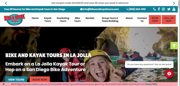
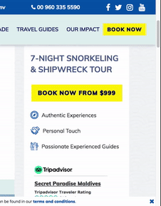
Step three: Go for contrast – it’s like adding sprinkles to your ice cream! Your booking button should stand out like a unicorn in a sea of ponies. Pick a color that’s totally different from the rest of the page.
Step four: Use imperative verbs. This might seem silly to you, but it’s important with a button that you tell people what to do. “Book Tour” will always work better than “Bookings & Enquiries”.
Step five: Amp up the urgency! They need to book NOW, not later. Try “Book Tour Now” instead of a plain “Book Tour”. And if you’ve got limited spots, show it on a calendar to crank up that urgency!
Step six: Write in the first person. Joanna Wiebe is one of the world’s top experts in writing amazing buttons, and she says that we should always write in the first person. A good rule of thumb, she states, is to take the words ‘I want to’ – whatever follows those words should be the words on the button. If I’m looking at your site and want to book my spot now, this will be made easy-peasy with a button that reads “Book My Spot Now” on the button!
For example the words ‘Start My Free Trial’ works WAY better than ‘Start Your Free Trial’ – by a difference of around 25%.
Step seven: Make visitors feel like they’ll be missing out (FOMO) – people are much more likely to book when they’re worried that they will miss out. It’s like a magical spell! Skip the generic “tour” and go for an enticing call to action (CTA) with “Book Now” or “Book Your Tour Now”.
Step eight: Break the mold – make it pop! A rockin’ booking button needs to stand out from the crowd. It needs to be big and surrounded by white space and, if possible, it needs to break the visual lines of the design, it simply must stand-out in such a way that visitors can’t avoid it.
These are our eight awesome steps to crafting an amazing booking button! If you enjoyed reading about these tips, you may also want to learn about other important components to consider for your tourism website, such as writing content that sells, as well photography ethics and the best type of photos to share on your tour pages.
Find this article useful? Enter your details below to receive your FREE copy of 95 Epic Places To List Your Tours and receive regular updates from TourismTiger and leading industry experts.
By submitting this form you agree to TourismTiger contacting you via email.