[Updated October 2023]
In 2020, 61% of visits to U.S. websites(opens in a new tab) were made on mobile. Each year this number continues to increase- at the expense of desktops visitors. This statistic proves why you need to ensure your website works well on mobile as soon as possible. Think of all the sales you will be losing if mobile visitors to your site can’t find the booking button or get lost navigating the site! This will never be a problem if your website is built by the Team(opens in a new tab) here at TourismTiger, because all our sites are responsive; this means sites built by us work great on any type of device.
When implementing mobile optimisation it is essential that you understand and take into account the habits of a mobile user. They want answers to their questions and they want them instantly. Mobile users have a shorter attention span than desktop users and they won’t trawl through sites to find answers to their questions. If they can’t find what they’re looking for, they’ll quickly hop back to Google and try the next site in the search results. Lay out everything they will need in front of them so they can make a decision quickly.
Creating a smooth user experience is essential to the success of online sales, but mobile optimisation also affects your Google ranking. Mobile-friendly sites show up higher in search results (opens in a new tab)and Google quotes the statistic that if your site isn’t mobile-friendly, visitors are 5 times more likely to leave.
Here at Tourism Tiger, we ensure our client’s websites work seamlessly on the small screen. So with all that in mind, let’s consider the changes you can make to optimise your website on mobile.
Less is More
When designing for mobile, it’s essential that everything is scaled down. You have a lot less room to work with and you still need to factor in enough white space for users to focus on your content. Mobile users don’t want to be scrolling through chunky blocks of text to find the information they’re looking for. As we already mentioned, everything needs to be quick and easy to access.
As well as less text, consider the length of your pages; homepages especially should be shorter on mobile. At Tourism Tiger, we achieve this by using carousels and sliders for features such as galleries. These also encourage interaction and keep mobile users entertained and on the page for longer. For information that we want users to notice at first glance such as product cards, we use a vertical format so that no action is required to browse.

Typing on a mobile device can be tedious and cause users a lot of frustration, therefore ensuring as little typing is required as possible will have a positive effect on the user experience. This includes simplifying forms, we’ve all struggled filling out a complicated form on mobile only to receive an error message just when it’s completed and had to start all over again. The solution is to cut it down and respond to visitors by email giving them time to get to a desktop or encourage users to call you with a call to book button.
Simplifying design and graphics not only helps users to focus but also increases loading speed. Loading speed is a critical factor in mobile optimisation, if your site is slow on desktop it will be even slower on mobile. Google penalises sites with slow loading speeds on mobile and without taking action like optimising photos and reducing graphics and animations, you could see a slip in your ranking.
Responsive Web Design
Responsive web design is an approach that permits design across various devices and adjusts features and structure according to the device’s size and user behaviour. It is the solution to the issue of having 3 different designs for mobile, desktop, and tablet and allows more room for brand image consistency. All features on a web page adapt to the different screen sizes and resolutions ensuring that the page offers the same functionality and high-quality experience across all devices.
This approach not only benefits users, who will have a harmonious experience whether they are visiting on mobile or desktop, but it also ensures your brand identity is consistent and the grid system that is the foundation of responsive web design saves you time with its formatted layouts.
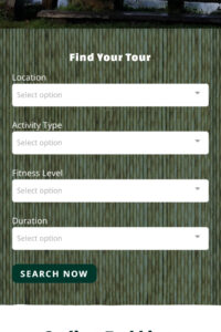
Navigation
Navigation is key to optimising your site for mobile. Smaller screens can make it harder to find things so ensuring that actions are as clear as possible is vital to the success of your site on mobile. The size of the buttons is key to encouraging action and sales. At Tourism Tiger we pin a large BOOK NOW button to each product page so that when users are ready to buy, the action is right in front of them.

When optimising your site for mobile devices keep movement at the forefront of your mind. Making buttons and actions clickable for thumbs and having features that work with the swiping movement are essential. When it comes to mobile menus, the hamburger menu works perfectly with smaller resolution screens. The hamburger menu gives you more precious screen real estate and stows away the menu until users need it.
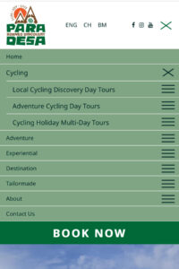
Another feature to aid navigation is the search bar, this is especially useful when you have a wide range of products. To avoid users scrolling through pages or the menu, give them the option to search for a particular product. This feature is a great bonus for return visitors who are visiting the site with the sole purpose of buying a product they have previously researched.
Pop-ups
How many times have you landed on a site on mobile only to be stuck with an oversized pop-up whose close button is off-screen and inaccessible? What did you do? The obvious: you left the site immediately to find a site that you could access. Pop-ups on mobile are a feature that many overlook and consequently cause serious headaches for users.
What’s more, Google has a strict list of rules for pop-ups and penalties for the sites that do not comply:
- Pop-ups must be as non-obstructive as possible. On mobile devices, pop-ups should only cover a small fraction of the screen.
- Pop-ups must be easy to close. It should be clear how a mobile user can dismiss the pop-up, usually via a clearly visible, decently-sized button.
- Pop-ups containing necessary information are exempt. The above guidelines do not apply to login dialogues, age verification forms, or other pop-ups that display essential information (such as cookie notices).
When optimising your own site for mobile, be sure to follow those guidelines so you do not fall into the pop-up trap!
Now that we’ve given you plenty of mobile optimisation inspiration, the rest is up to you. It’s important to consider that it’s a lot easier to adapt mobile to desktop rather than the other way around. So when beginning to design your website, take a “mobile first” approach. Mobile optimisation is essential for all sites but if your target audience is between the ages of 18-45 you should be treating mobile optimisation as your number one priority. If users can’t book on mobile, this sadly means that every day you are missing out on sales. If you don’t know where to start, contact us at Tourism Tiger and find out what our responsive web designs can do for you.
Find this article useful? Enter your details below to receive your FREE copy of 95 Epic Places To List Your Tours and receive regular updates from Tourism Tiger and leading industry experts.
By submitting this form, you agree to Tourism Tiger contacting you via email.
"*" indicates required fields